

-
7英寸屏幕,300PPI,Carta1300 -
高通8核处理器 -
4+64GB存储 -
2000mAh电池 -
192克 -
最高支持2TB拓展 -
云光屏(微晶蚀刻钢化玻璃盖板) -
支持电容笔手写(选配)

When the Leaf5 debuted last year, I got a device with a bunch of minor issues that I didn't hesitate to point out in my review.
Look at the picture below — with that kind of quality control, who wouldn't be upset?
When I did a full color range review for the Leaf5 in March, I didn't see those quality control issues again.
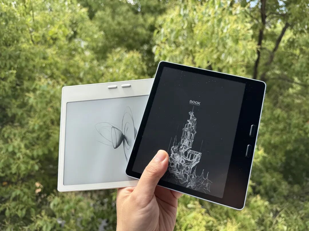
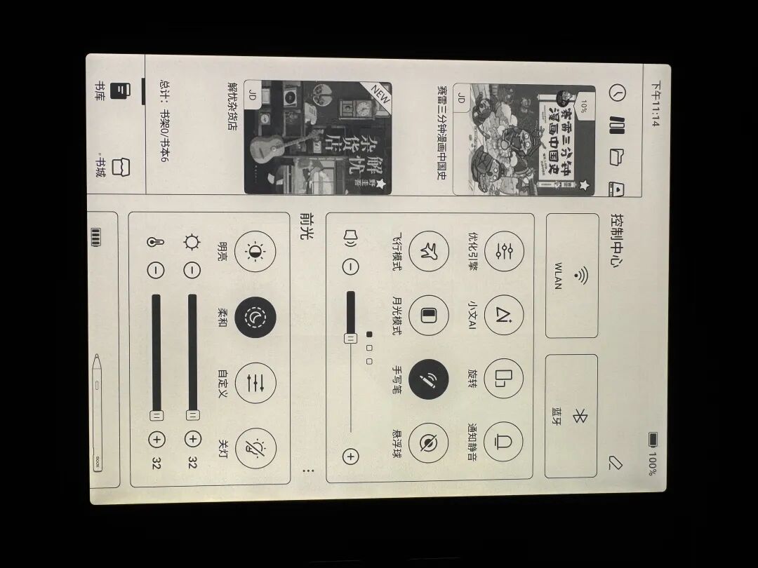
Today, I placed the new Leaf5+ next to the international version Go 7, and it suddenly hit me: BOOX started using an all-black lock screen background at a certain point — and they did so with confidence.
Some might not get why that's a big deal.
An all-black background means any flaw in the screen or frame is immediately visible — no hiding behind gray patterns or bezels.
That they're willing to do this shows BOOX has confidence in their own reliability.
So does the “+” in Leaf5+ actually add value? Let's find out today.
First, a quick rundown of the hardware specs:
7-inch screen, 300 PPI, Carta1300
Qualcomm 8-core processor
4+64 GB storage
2000 mAh battery
192 grams
Supports up to 2 TB expansion
Cloud-light screen (micro-etched tempered glass cover)
Optional capacitive pen for handwriting
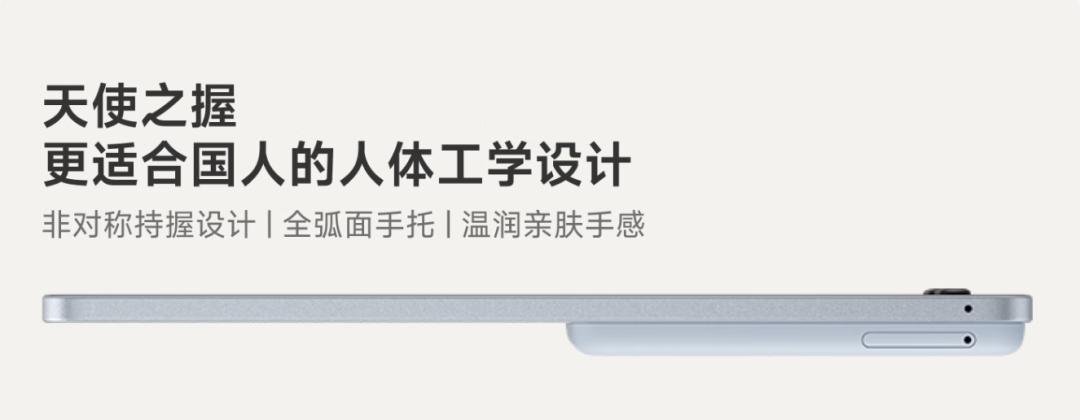
While the "Angel Grip" handle is still slippery and not particularly comfortable — let's leave that to the Leaf6 to fix.
Design: a familiar color
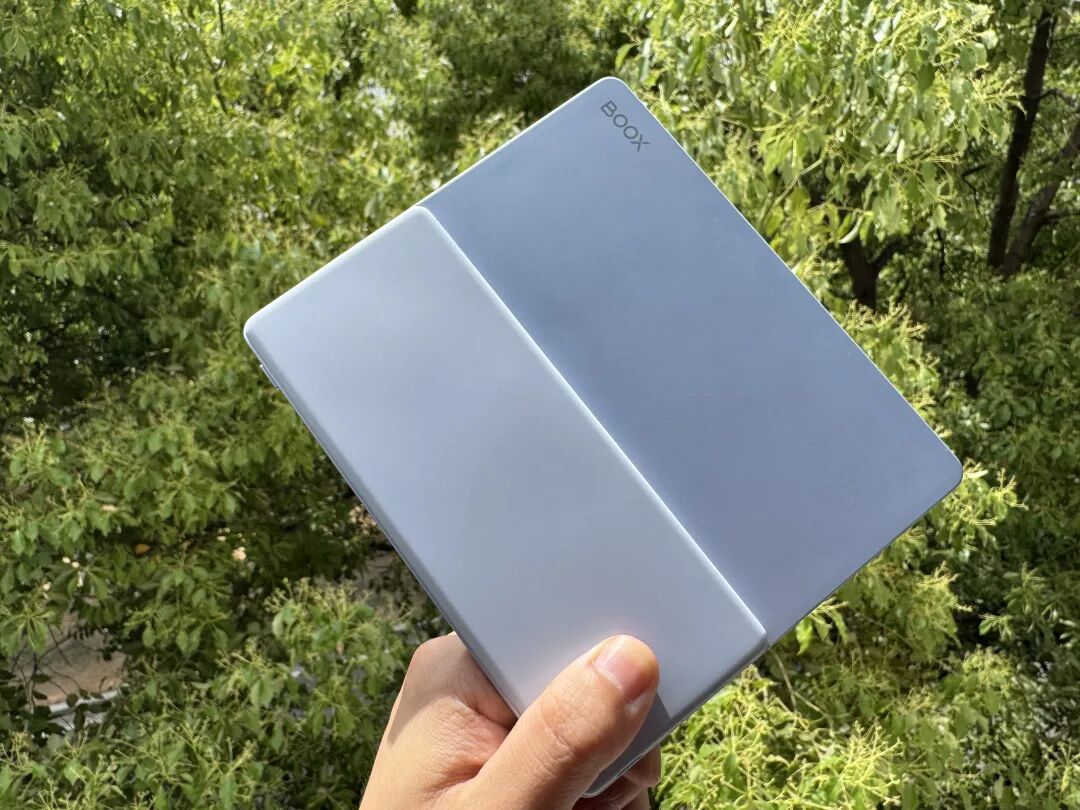
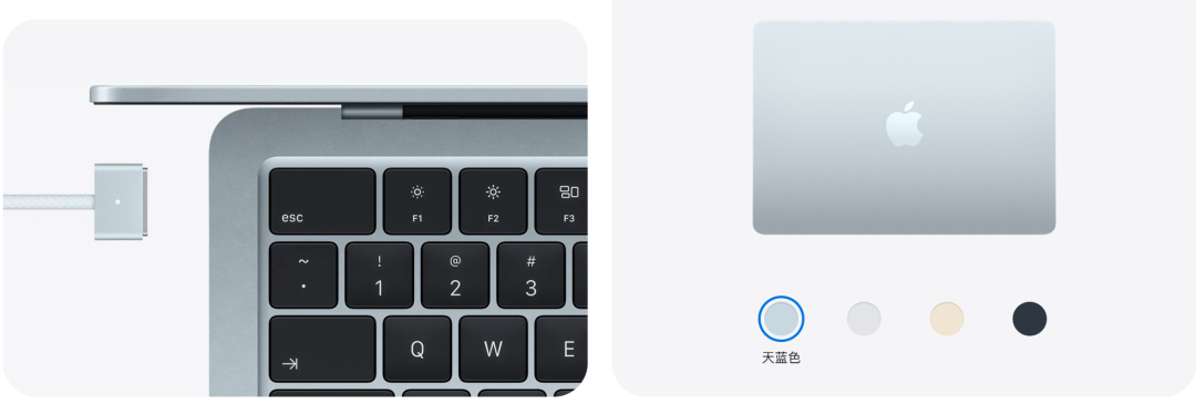
The first thing I noticed about the Leaf5+ was the body color.
Before you decide if you like it, think about where you've seen this color before.
Open the Apple website and look at the MacBook Air color options — it's almost identical. (Note: the Air blue is slightly more vibrant in person than the picture shows, but the match is still very close.)
Moving on from the color...
Screen: the complaints paid off
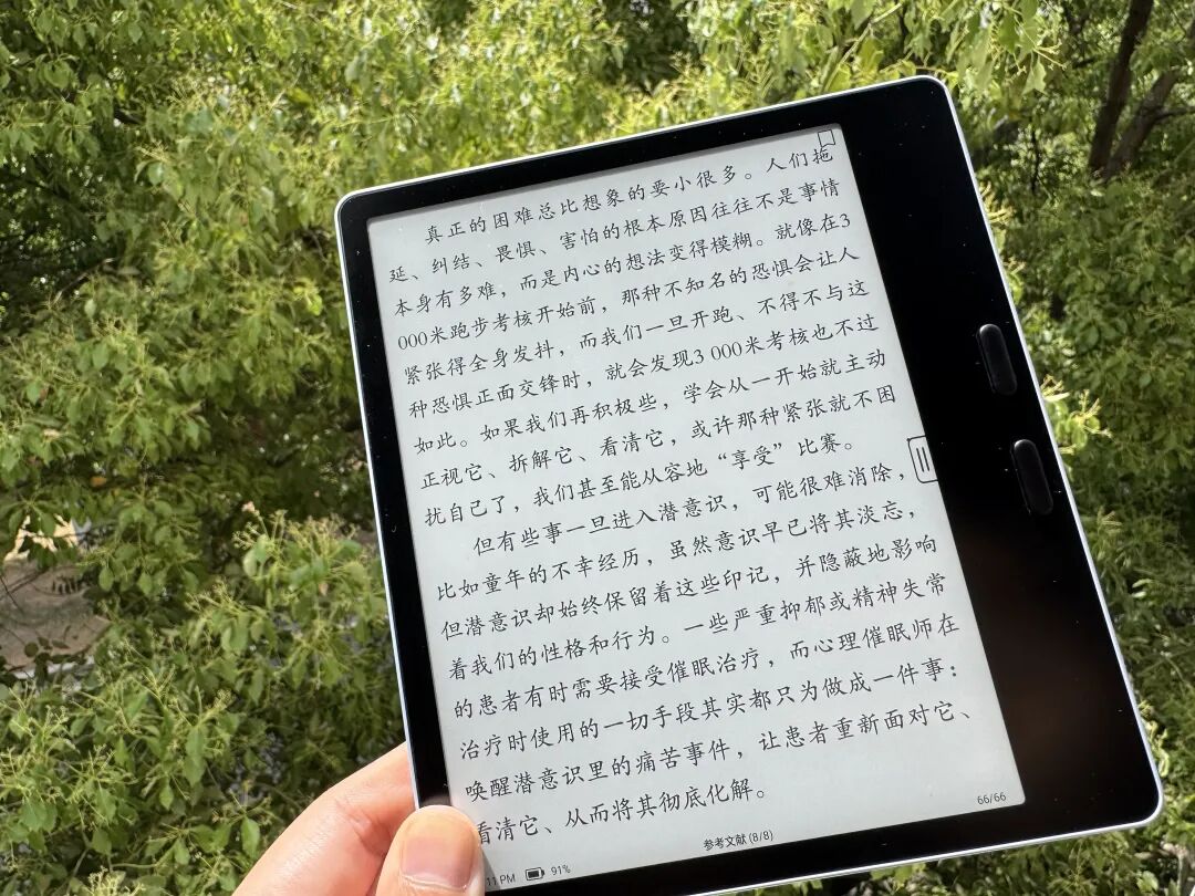
The most immediate improvement in the Leaf5+ is the backlight uniformity.
With the lights cranked to maximum, the entire screen is evenly lit, except for a slight darkening near the LED source in the bottom right — which is normal and expected.
The annoying "spotlight" effect from the LEDs that plagued previous models is gone.
The black frame also eliminates any light leakage, and the fit between the screen and the frame appears tight without any gaps letting light through.
The glass itself is micro-crystal etched (cloud-light), which is currently the top-of-the-line for e-ink cover glass — though it comes at a cost.
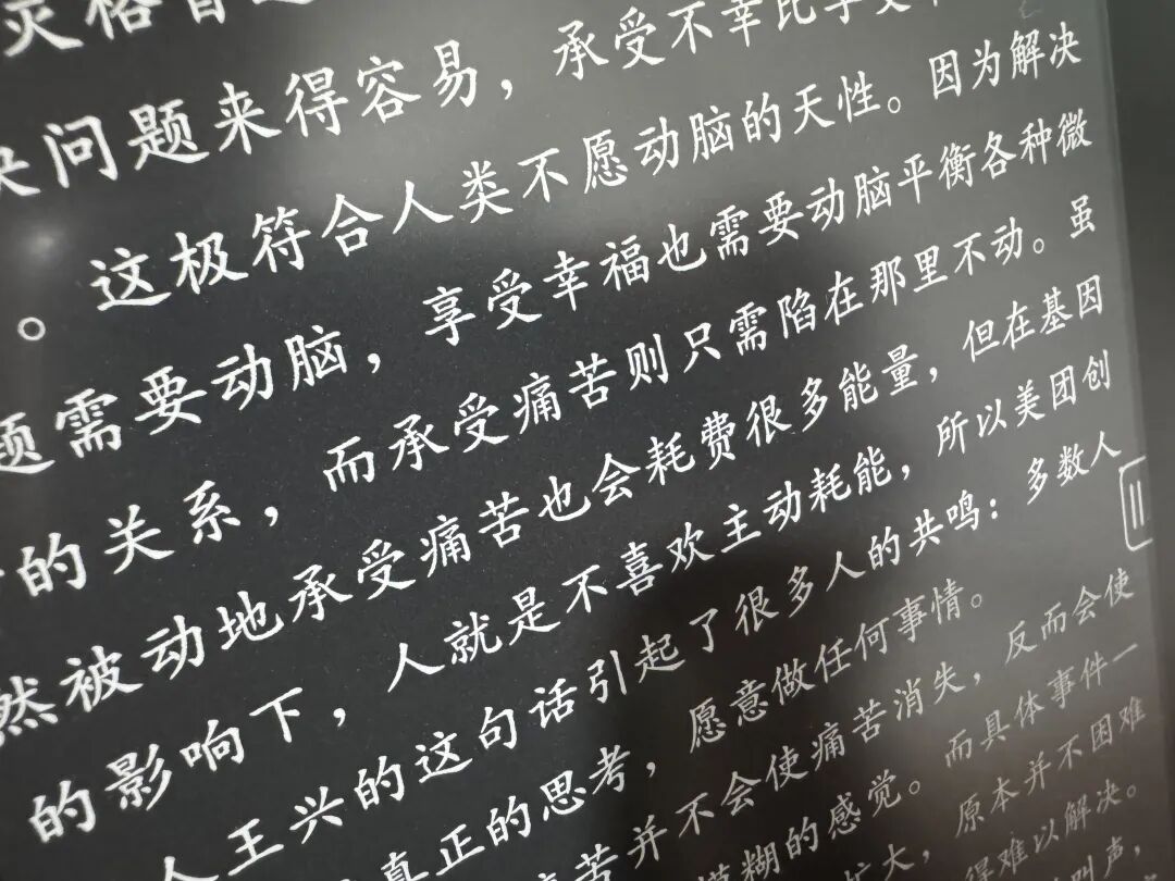
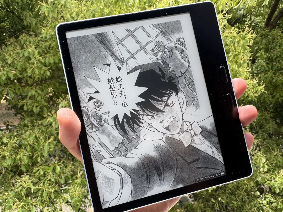
Coupled with the 256-level grayscale, the contrast for comic books (which often rely on bold black lines) is excellent. The blacks are deep, the whites are bright, and the transitions are smooth without any "muddy"ing of the image.
The increased transparency of the cloud-light screen is visibly superior to standard glass. This is one of the standout features of this upgrade.
The Leaf5+ screen is noticeably whiter and more transparent than the standard Leaf5.
Stylus: functional, but not ideal
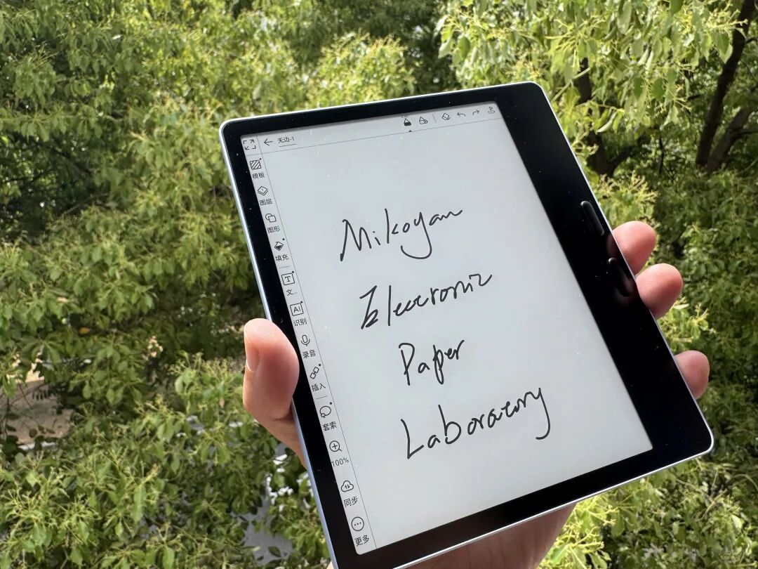
The biggest functional change for the Leaf5+ is the addition of stylus support.
While BOOX introduced a stylus with the overseas Go 7 model, it was heavily criticized.
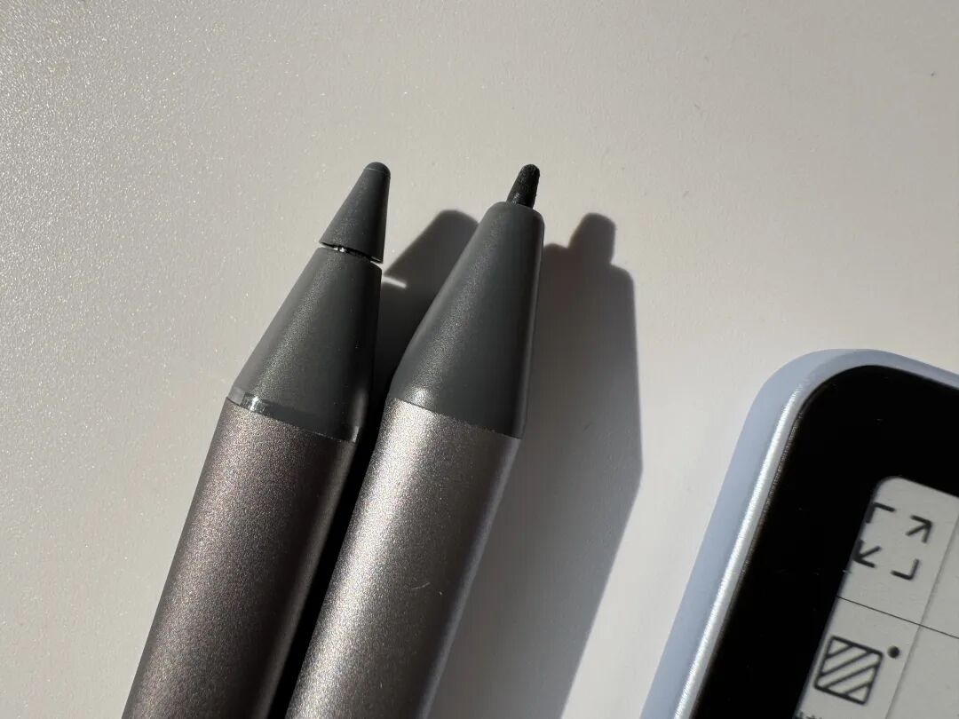
Let's look at the physical comparison:
1. The Leaf5+ comes with a thin stylus tip.
2. The Go 7 used a thick, plastic tip.
A thick, plastic tip is a disaster waiting to happen — once the point wears down, it becomes a screen scratcher. The thin, hard tip on the new pen is much more durable and less likely to damage the glass.
However, the core issue with the 7-inch format remains: to keep the price low, manufacturers are forced to use capacitive styli instead of more precise electromagnetic pens.
The Leaf5+ stylus is a standalone unit that requires its own charging, which is less convenient than a passive pen that clips onto the device.
If you only want to write occasionally, you might find the pen is out of battery when you actually need it.
Leaf5 vs. Leaf5+: Which to choose?
In the world of Chinese tech reviews, you'll find that every brand has its own niche; there's no "do-it-all" champion.
BOOX's strongest suit is its software — the system optimization is considered top-tier globally.
The Leaf5+ is essentially a Leaf5 with a better screen and added stylus support. For a full review of the base features, you can check my previous Leaf5 article.
So, if you don't need to write on the device, which model should you pick?
Even if you ignore the stylus, the screen quality alone justifies the price difference. The cloud-light glass provides a much better visual experience — brighter, more contrasty, and less reflective.
A screen is the most critical component of an e-reader, and this is not an area where you want to cut corners.
Manufacturers can easily inflate specs with processors or RAM, but improving the actual quality of the display requires significant investment — which BOOX has clearly made here.
Original article link: https://mp.weixin.qq.com/s/Z6KFWv_JdjKDhCj8yVZ5JA
Many manufacturers can pile on specs, but few are willing to repeatedly refine invisible details like screen quality — that’s what sets us apart.
原文链接: https://mp.weixin.qq.com/s/Z6KFWv_JdjKDhCj8yVZ5JA